Wedding colour palettes for 2026 (and the stationery that suits them)
In short
A wedding colour palette usually works best with one dominant colour, one supporting colour and one metallic or neutral. On stationery, the dominant colour carries the design, the supporting colour goes on the envelope, and the metallic appears as foil on names and dates.
- Three colours is the practical maximum for a printed suite — beyond that the invitation starts to look busy at A5 and smaller.
- Uncoated papers such as Coral Book 300gsm and Colorplan Natural 270gsm soften and warm every colour printed on them; Premium Silk 300gsm keeps colours bright and saturated.
- Envelopes are the cheapest way to introduce a second colour — we stock white, ivory, blush pink, sage green, dusty blue and kraft.
- Foil (gold, rose gold, silver or copper) reads as a colour in its own right, so count it as one of your three.
Choosing a wedding palette is easier when you start from something physical rather than a screen: the venue's stonework, the bridesmaid fabric, the flowers your florist can actually get in your month. Once you have two or three colours, the stationery is where they first appear in public — usually a year before anyone sees the table settings.
The ten palettes we print most often
| Palette | Colours | Suits | Paper & envelope pairing |
|---|---|---|---|
| Sage & cream | Sage green, ivory, warm gold | Barns, orangeries, spring and early autumn | Colorplan Natural 270gsm with a sage green envelope and gold foil |
| Dusty blue & silver | Dusty blue, soft grey, silver | Country houses, winter and coastal weddings | Colorplan Bright White 350gsm with a dusty blue envelope |
| Blush & rose gold | Blush pink, oyster, rose gold | Romantic marquees and garden weddings | Splendorgel Avorio Cream 300gsm with a blush envelope and rose gold foil |
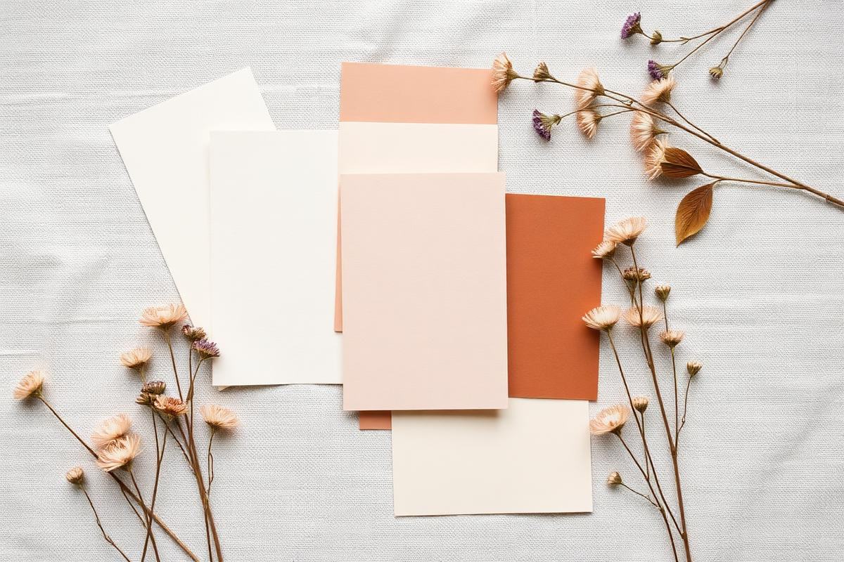
| Terracotta & ochre | Terracotta, ochre, olive | Late summer, boho and destination weddings | Coral Book Uncoated 300gsm with a kraft envelope |
| Black tie monochrome | Black, bright white, silver | City venues and evening receptions | Conqueror CX22 320gsm with a white envelope and silver foil |
| Burgundy & gold | Burgundy, deep plum, antique gold | Autumn, castles and candlelit dinners | Colorplan Bright White 270gsm with gold foil |
| Ivory on ivory | Ivory, cream, champagne | Church weddings and traditional receptions | Splendorgel Avorio Cream 300gsm, blind-debossed or gold foiled |
| Meadow brights | Coral, buttercup, cornflower | Festival and marquee weddings | Premium Silk 300gsm with a white envelope |
| Frosted white & silver | Snow white, pale grey, silver | December and January weddings | Nettuno Bianco Artico 300gsm with silver foil |
| Natural kraft & green | Kraft, forest green, copper | Woodland, rustic and eco-minded weddings | Nautilus Classic Recycled 300gsm with a kraft envelope and copper foil |
How colour behaves on paper
Colour printed on paper never matches a screen exactly, because a screen emits light and paper reflects it. That difference is largest with pale pastels and very saturated brights. Two practical rules: pick your palette from printed samples rather than a phone, and expect an uncoated sheet to knock roughly a shade of brightness off every colour.
- Coated silk (Premium Silk 300gsm): brightest, crispest colour — best for photographic and full-bleed designs.
- Uncoated (Coral Book 300gsm, Colorplan, Nautilus Recycled): softer, warmer, more tactile — best for muted and natural palettes.
- Textured and felt-marked (Nettuno Bianco Artico 300gsm, Tintoretto Gesso 300gsm): adds shadow to flat colour, so dark inks look richer.
- Vellum (Cromatico 110gsm): translucent, so whatever sits beneath it tints the colour above.
Where each colour should go
A suite reads best when the same colour does the same job on every piece. We suggest: dominant colour for the design and headline type, supporting colour for envelopes and belly bands, metallic reserved for names and the date only.
If a guest can tell your save the date and your order of service came from the same wedding without reading a word, the palette is doing its job.
Testing before you commit
Order a sample pack before the full run. It contains printed pieces across our paper stocks so you can hold the colour under daylight and under the warm light most venues use in the evening. Every full order also includes a free digital proof within two working days and two rounds of amends, so wording and colour can still be adjusted before print.
Common questions
How many colours should a wedding palette have?
Three works best on stationery: one dominant colour, one supporting colour and one metallic or neutral. Four or more tends to look crowded once it is scaled down to an A6 save the date.
Will the printed colour match my screen exactly?
No — screens emit light and paper reflects it, so pale pastels and very saturated brights shift the most. Order a sample pack and check your digital proof, which is included free with every order.
What envelope colours do you stock?
White, ivory, blush pink, sage green, dusty blue and kraft. Guest address printing can be added to any of them for £0.20 per envelope.
Which foil colour goes with sage green?
Gold and copper both work with sage; silver tends to look cold against it. Gold foil on Colorplan Natural 270gsm is our most-ordered sage combination.
Ask the studio
We print every order ourselves in Fordingbridge. If you would like colour advice for your venue and flowers, send us the details — … or 01425 654908.
Keep reading
- Eleven wedding themes, and how to make the stationery match
Explore eleven wedding themes, from floral and art deco to modern, vintage and winter, with stationery details that make each style work.
- How to choose wedding invitation paper: weight, texture and finish
A practical guide to paper weight, coated and uncoated stocks, texture, vellum and foiling for wedding invitations.